A drawn page map
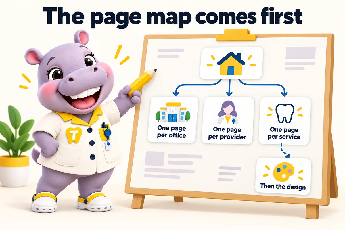
Every office, provider and service page listed and approved before design starts, with the navigation that carries them.
Service file
Designing a dental group website means deciding what a page is for before deciding what it looks like. A single practice can carry its whole story on one page. A group cannot: each office has its own address, its own hours, its own providers and its own patients searching a different town. Our design work starts by drawing the page map, then dresses it. The result is a site where a patient two towns from the flagship still lands somewhere that answers them.
What it costs
We start every group project by listing your offices, your providers and the services each office actually offers, then drawing the page for each one. That map settles most of the design questions before a single color is picked: how many items the navigation carries, whether services need to be grouped by category, whether providers deserve a directory of their own, and where the finder sits on a phone. Groups that skip this step end up with a beautiful home page and an address list at the bottom, which is the single most common shape of a dental group website and the reason so many satellite offices are invisible.
A group site is a system, so we design components rather than pages: an office card, a provider card, a service block, an hours table, a booking panel, a finder result. Each one is drawn once and reused everywhere, which is why a site with forty pages still feels designed rather than assembled. It also means adding your eleventh office does not require a designer. The visual language is set on the onboarding call, built from your existing brand if you have one, and applied consistently: one accent color, one corner radius, one type system across every office page.
Every layout decision answers one of four questions a patient asks, in the order they ask it: is this the right kind of practice, is there an office near me, can I get seen for the thing I need, and how do I ask for an appointment. So the finder sits above the fold on the home page, the office page opens with the address, the hours and a request button rather than a paragraph about the practice, and the service page names the offices and providers who offer it. Nothing on the page tries to be clever ahead of being useful.
We design the site; your clinicians own everything said about care. Practically, that shapes the design: no before-and-after galleries presented as results, no success-rate panels, no testimonial widgets that read as outcome claims. Service pages are laid out to explain what a procedure involves, what to ask and how to book, with a clear route to a provider for anything specific. It is a constraint that makes the pages better, because the space that would have gone to claims goes to the information a patient actually needs before they call.
Who it is for
Dental groups and growing practices that want a site designed around their offices, providers and services rather than a theme with an address list.
Symptoms
Deliverables
Every office, provider and service page listed and approved before design starts, with the navigation that carries them.
One accent, one radius, one type scale, applied identically across every office so the group reads as one brand.
Service plus town to the nearest office, its providers, its hours and a request button, reachable in two taps.
Office card, provider card, service block, hours table and booking panel, drawn once and reused everywhere.
Most patients arrive on a phone between appointments, so the phone layout is the one we design and review first.
Real contrast ratios, focus states you can see, and a light and dark theme that both work rather than one being an afterthought.
Thirty minutes
We open a site built for a group like yours, walk the pages a patient would, and tell you which plan fits. Plans from $137 a month; the $797 build fee is invoiced after launch.
How the work is done
The same four steps for every service. The only thing paid before launch is the first month.
Pick a plan and pay the first month. That is the whole commitment; the $797 build fee waits until your site is live.
Thirty minutes with your operations lead: offices, providers, services, brand, where each office's requests should go, and hub or one site per location.
We design the site, write the pages, configure the finder for each office and connect each front desk. You review, we revise.
Your site goes live in 7, 10 or 15 days depending on the plan. Only then is the $797 build fee invoiced. Weekly updates start the same week.
Timeline
Counted from the onboarding call, not from purchase. Revisions after launch are completed within 2 to 5 working days.
Cost
Design is inside every plan. The plan you choose is driven by whether you want the AI Engine and the Content Engine, not by the number of pages or offices.
What's in each plan
What each feature does, the everyday problem it removes, what you have to do (usually nothing), and which plan carries it.
Out of scope
So nobody is surprised after ordering. Each of these is a deliberate line, not an upsell waiting to happen.
We do not write treatment recommendations, success rates, outcome claims or before-and-after captions. Your clinicians own every statement about care.
Request forms ask for a name, contact details, the office, the service and a preferred time. Medical history, insurance IDs and consent forms stay in your own intake system, never on the website.
We build pages that are fast and relevant enough to be good landing pages for your ads. Running and bidding on the campaigns themselves stays with you or your ads partner.
We route requests into the system or CRM each office already uses, by API, Zapier or Make. We do not sell, host or administer the practice software itself.
We use the office and team photos you own and have consent to publish, sized for their slots. Where you have none yet we use neutral, non-clinical images until yours arrive.
There are none. One fee covers every office in the group; extra revisions beyond 5 a month are a flat $20 each.
Reviews
Most of our visitors are on phones, so that is where I reviewed the new dental office selection pages. The essentials are within the first screen, with an obvious way to inquire. It is far more practical than the old page when we share it with a caller.
Got Mobile navigation and page layout for dental office selection
We handed over a folder of our real dental office selection replies and let them work from that. The recurring questions were pulled out, rewritten clearly, and approved line by line by our team. The phone calls about basic dental office selection details have noticeably thinned out.
Got FAQ research and editorial review for dental office selection
The preparation page for dental office selection works because it keeps its focus. It tells people what to have ready before we speak, without demanding everything up front. The link now goes out with our reply to every new inquiry.
Got Preparation guide and inquiry support for dental office selection
Built in, not bolted on
A dental website carries obligations a brochure site does not. These ship with every plan, written for your practice and reviewed by you before launch.
These pages and practices help you meet common US requirements for a dental practice website. They are not legal advice, and we recommend your own counsel reviews the policies before launch. We are not a dental practice, dental group, dentist or healthcare provider, and we are not a law firm.
A privacy policy and site terms written around what your site actually collects, drafted for your review and your counsel's sign-off. Built with state privacy laws such as the CCPA in California in mind.
Analytics and marketing tags load only after a visitor agrees, and the cookie policy lists what the consent banner controls.
Real contrast ratios, visible focus states, keyboard navigation and alt text, built with the Americans with Disabilities Act (ADA) and WCAG 2.2 AA in mind, plus a statement telling patients how to report a problem.
Request forms are designed not to collect health information. That keeps the website out of your HIPAA scope as far as a website can be, while your intake system handles records.
Where a form or the AI Engine sends texts, consent wording sits next to the phone field, and we file the A2P 10DLC carrier registration for you on plans with the AI Engine.
Service pages and articles say they are general information, not a diagnosis or treatment plan, and send patients to your providers for anything about their own care.
Risk reversal
Each promise is written with its condition in plain sight, so nothing is discovered after the invoice.
The $797 one-time build fee is invoiced after launch, once you have seen the site live and are happy with it.
Condition The first monthly fee is paid up front to start the plan.
Every page we build scores at or above the target on mobile and desktop at launch.
Condition If a page drops below it because of our work, we fix it at no charge and it does not use a revision.
The site starts ranking for local searches in your area within the window.
Condition If it has not, we keep working on it at no charge. We never promise a specific position.
Case studies
No. 02General dentistry
With dental office selection, people gave up partway through the menu or called simply to ask where things were. Even the team struggled to direct someone to the right page without a desktop in front of them.
15 working days
No. 03General dentistry
Day to day with dental office selection, dependable answers existed, but only inside old email chains. Visitors called about simple matters, and new staff had no reference to check their wording against.
20 working days
No. 05Endodontics
For dental office selection, the briefing's content depended on its author and their afternoon. Consistency, not quality, was what was missing.
10 working days
From your brand if you have one. We take your logo, colors and type and build the system around them, and we tell you plainly if a color will not hold contrast on a real page. If your brand exists only as a logo, we build the rest of the system on the onboarding call and show it to you before the pages are built.
The design is agreed during the build and revised until you approve it, before launch. After launch you get 5 revisions a month of any size, raised in your client portal and completed within 2 to 5 working days. A redesign of a page layout is one revision.
Each office page has its own photography, its own providers and its own hours, but the visual system stays shared. Offices trading under genuinely different names are usually better served by one site per location, which we also build, and there each site gets its own visual treatment.
We design the request panel and connect it to the destination each office already uses, whether that is a practice management system, a group CRM or both. The request carries the office, the provider and the service, so nothing is forwarded by hand.
Yes. Design, build, hosting, weekly detail updates and revisions are all inside the monthly plan. The one-time build fee is invoiced only after the site is live and you are happy with it.
Yes. We agree the visual system and the page map first, show you the key page types, then build the rest on that system. You approve before launch.
Yes. We build from your logo, colors, type and photography, and tell you plainly if a color will not hold contrast on a real page.
It is built with the ADA and WCAG guidance in mind: real contrast ratios, visible focus states, keyboard navigation and alt text on images, plus an accessibility statement on the site.
A live walk-through of the site you would get, in about 30 minutes. Plans from $137 a month, the $797 build fee invoiced only after launch, domain and hosting included.
Book a demoOr email and a person replies within one working day.
ChairsideWeb uses the cookies below. Necessary cookies keep the site working and cannot be turned off.
Saved on this device only. Press Esc to close.